RDT mobile wrapper using React Context
One of the complex things a web developer needs to do is display tables, basically because a table needs to be easy to use, I mean provide pagination, filtering, sorting and everything else to handle the data. Sometimes achieving this on the desktop is complex but doable, but on the mobile side it might be even a bit more complex, that’s why I’m now going to share my table wrapper to make this task easy.
As you read in the title, one thing we need to start building our tables is the React Data Table Component (RDT), which is a powerful package that provides a nice API for sorting, paging, filtering, styling, and more.
Now, if you took a look at the RDT documentation, you probably noticed that the setting to make the table mobile responsive is out of the box, so what is the point of this post?
Well, the option is there, but when you need to add action buttons to open a modal window, download a file, or whatever you need to do, there’s a good chance you’ll need to repeat the code multiple times, depending on how many tables your application needs.
In order to explain what will this wrapper resolve I’m going to provide a repository with all the code used.
RDT installation
- Install RDT by using one of the next commands:
npm i react-data-table-component styled-componentsyarn react-data-table-component styled-components
dataprop: an array of objects where all table information is contained.columnsprop: a memoized object where all columns props will be defined, e.g.:
const columns = useMemo(() => [
  {
    name: 'Column name 1',
    id: 'columnId1',
    selector: ({ attribute1 }) => attribute1
  },
  {
    name: 'Column name 2',
    id: 'columnId2',
    selector: ({ attribute2 }) => attribute2
  },
  {
    name: 'actions',
    id: 'actions',
    cell: ({ attribute3 }) => (
      <div>
        <span onClick={(attribute3) => {}}Action 1</span>
      </div>
    ),
    hide: 'md'
  }
  // more columns...
], [])
By adding the property hide: 'md' if the window resolution is less than the desktop resolution the column will be automatically hidden, that is easy but now will needed a way to display on mobile and now is where the ExpandedComponent will be useful.
Creating the wrapper
Tablecomponent, basically will be a general wrapper created just to share the styles in case the app needs to use several tables, you can find more details here: RDT PatternsExpandedComponentbasic anatomy:
<ExpandedWrapper>
  <Item label="ColumnName">{plainValue}</Item>
  <Item label="ColumnName">
    <span>children</span>
  </Item>
</ExpandedWrapper>
- What are
ExpandedWrapperandItem? Both are single components used to keep the styles consistency and you can create your own components as you want:ExpandedWrapperconst ExpandedWrapper = ({ children }) => { return <div className="grid text-sm mr-4">{children}</div> }Itemconst Item = ({ label, children }) => { return ( <div className="flex"> <div className="max-w-max my-2 ml-16 font-semibold"> <span>{label}</span> </div> <div className="max-w-max my-2 ml-4"> <span>{children}</span> </div> </div> ) }
What the issue is?
The answer to this is quite simple, the Datatable component has a data prop and this is automatically shared in the expanded component, but if you need to provide functionality to your action buttons or links, you need to create the function for the desktop view in the “main component” and the mobile function in the “expanded component”, so this is where React Context will help to avoid code duplication using some single lines of code.
ExpandedComponentProvider
import { createContext } from 'react'
const ExpandedComponentContext = createContext()

const ExpandedComponentProvider = ({ children, ...rest }) => {
  return (
    <ExpandedComponentContext.Provider value={{ ...rest }}>
      {children}
    </ExpandedComponentContext.Provider>
  )
}

export { ExpandedComponentProvider, ExpandedComponentContext }
useExpandedComponent
import { useContext } from 'react'
import { ExpandedComponentContext } from 'contexts/ExpandedComponentProvider'

const useExpandedComponent = () => {
  const context = useContext(ExpandedComponentContext)

  if (context === undefined) {
    throw new Error('useExpandedComponent must be used within a ExpandedComponentProvider')
  }

  return context
}

export default useExpandedComponent
Now you can wrap your table using ExpandedComponentProvider to share all the functions or props you want and then in the expanded component use the hook useExpandedComponent to get them all and use them as you want them, note: expandableRows is a flag that you need to control when you want to use the expanded component, for example using a media query or a function to get the window width, e.g.:
import { useCallback, useMemo } from 'react'
import { Table } from 'components/Table'
import { ExpandedComponentProvider } from 'contexts/ExpandedComponentProvider'
import ExpandedExampleComponent from 'components/ExpandedExampleComponent'

const Example = () => {
  const data = [
    {
      attribute1: 'attribute1'
    },
    {
      attribute2: 'attribute2'
    },
    {
      attribute3: 'attribute3'
    }
  ]

  const handleClick = useCallback(
    (url) => () => {
      window.open(url, '_blank', 'noopener,noreferrer,resizable')
    }, [])

  const columns = useMemo(() => [
    {
      name: 'Column name 1',
      id: 'columnId1',
      selector: ({ attribute1 }) => attribute1
    },
    {
      name: 'Column name 2',
      id: 'columnId2',
      selector: ({ attribute2 }) => attribute2
    },
    {
      name: 'Actions',
      id: 'actions',
      cell: ({ attribute3 }) => (
        <span onClick {handleClick(attribute3)}Action 1</span>
      ),
      hide: 'md'
    }
    // more columns...
  ], [])

  return (
    <ExpandedComponentProvider onClick={handleClick}>
      <Table
        name="demo"
        columns={columns}
        data={data || []}
        expandableRows
        expandableRowsComponent={ExpandedExampleComponent}
	// more props...
      />
    </ExpandedComponentProvider>
  )
}

export default Example
and the ExpandedExampleComponent :
import { Item, ExpandedWrapper } from 'components/Table'
import useExpandedComponent from 'hooks/useExpandedComponent'

const ExpandedExampleComponent = ({ data }) => {
  const { onClick } = useExpandedComponent()
  const { attribute1, attribute2, attribute3 } = data

  return (
    <ExpandedWrapper>
      <Item label="Column Name 1">{attribute1}</Item>
      <Item label="Column Name 2">{attribute2}</Item>
      <Item label="Actions">
	<span onClick={onClick(attribute3)}Action 1</span>
      </Item>
    </ExpandedWrapper>
  )
}

export default ExpandedExampleComponent
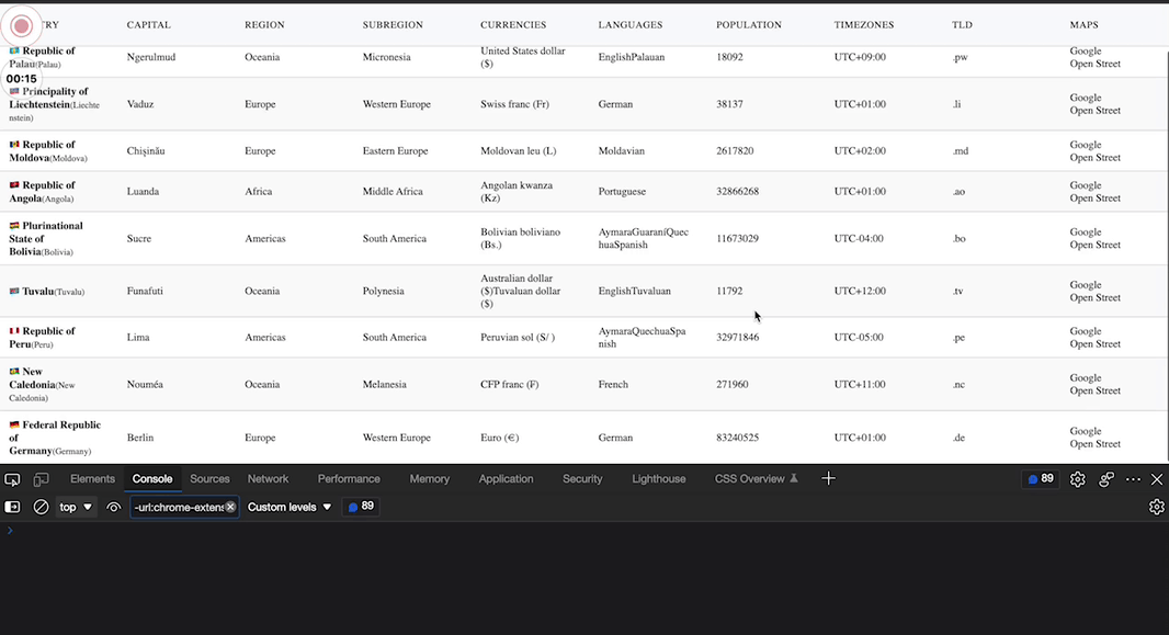
Live preview:
Final thoughts
As you can see you can create amazing tables using RDT and in combination with React Context you can also add an easy way to handle them without much effort.
I hope that this small contribution can help you reduce your table implementation times, for me it has been very easy to work with them avoiding repeating code at the same time making their maintenance easier.
Happy Coding!